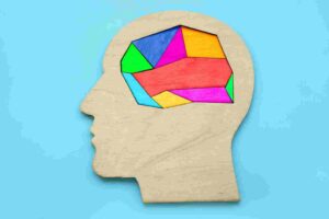
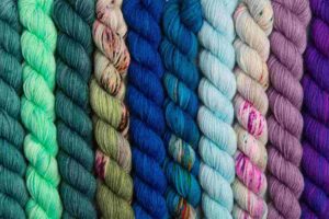
Color is all around us, influencing our perceptions and emotions in ways we may not even realize. From the vibrant red of a stop sign to the soothing blue of a clear sky, colors can evoke specific feelings and reactions within us. This phenomenon is known as color psychology, the study of how colors affect our minds and mood. In this article, we will delve into the intriguing world of color psychology, exploring the basics of color theory, understanding how colors impact our emotions, and uncovering the fascinating cultural influences on color perception.
The Basics of Color Theory
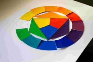
To understand color psychology, it’s essential to grasp the fundamentals of color theory. Colors are categorized into three primary colors: red, blue, and yellow. These primary colors can be combined to create secondary colors, such as green, orange, and purple. Additionally, colors have different properties, including hue (the name of the color), value (the lightness or darkness of the color), and saturation (the intensity or purity of the color).
Color theory also introduces the concept of color harmony, which refers to the pleasing combination of colors. Complementary colors, such as red and green, contrast strongly when placed together. Analogous colors, like blue and purple, are adjacent on the color wheel and create a harmonious effect. Understanding these principles will help us comprehend how colors evoke specific emotions and moods.
How Colors Affect Our Emotions
Colors profoundly impact our emotions, with each hue eliciting a unique response. Let’s explore some of the most common emotions associated with different colors:
- Red: The color of passion and energy, red evokes strong emotions such as love, anger, and excitement. It grabs attention and can increase heart rate and blood pressure.
- Blue: Often associated with calmness and tranquility, blue has a soothing effect on the mind. It is also perceived as trustworthy and dependable, making it a popular choice in corporate branding.
- Yellow: The color of happiness and optimism, yellow stimulates mental activity and promotes feelings of joy. However, excessive yellow can lead to feelings of anxiety or frustration.
- Green: Symbolizing nature and harmony, green has a balancing effect on emotions. It is often associated with growth, renewal, and relaxation.
- Orange: A vibrant and energetic color, orange combines the passion of red with the cheerfulness of yellow. It is known to stimulate enthusiasm and creativity.
- Purple: Long associated with royalty and luxury, purple conveys a sense of elegance and mystery. It can also spark creativity and spiritual awareness.
Understanding how colors influence our emotions allows us to harness their power in various aspects of our lives, from marketing and branding to interior design and personal well-being. By leveraging color psychology, we can create environments and experiences that evoke the desired emotional response.
The Color Psychology of Primary Colors

Each primary color holds its psychological significance, shaping our perceptions and emotions in distinct ways. Here is the color psychology of primary colors:
Red: As the color of passion and power, red substantially impacts human behavior. It is often associated with love, desire, and energy. Red can increase heart rate and blood pressure, symbolizing intensity and urgency. In marketing, red is commonly used to create a sense of urgency or to attract attention. However, excessive use of red can also lead to feelings of aggression or anger.
Blue: Blue is often associated with calmness, trust, and dependability. It has a soothing effect on the mind and body, making it an ideal choice for environments where relaxation is desired. Blue is frequently used in healthcare settings to promote a sense of serenity and trust. However, too much blue can create feelings of sadness or coldness.
Yellow: The color of happiness and optimism, yellow is known to stimulate mental activity and promote feelings of joy. It is often associated with warmth and sunshine, evoking a sense of positivity and energy. In marketing, yellow grabs attention and creates a sense of urgency. However, excessive yellow can lead to feelings of anxiety or frustration.
Understanding the psychological impact of primary colors can help us make informed choices when designing spaces, creating brands, or even selecting the colors of our clothing. By aligning our color choices with the emotions we want to evoke, we can create powerful and meaningful experiences.
The Impact of Secondary Colors on Mood
Secondary colors, created by combining primary colors, possess psychological effects on mood and emotions.
Green: Combining the calming properties of blue with the vibrancy of yellow, green is often associated with nature, growth, and harmony. It has a balancing effect on emotions and is known to promote feelings of relaxation and well-being. In interior design, green is commonly used to create a sense of tranquility and connection to the natural world.
Orange: As a vibrant and energetic color, orange combines the passion of red with the cheerfulness of yellow. It is known to stimulate enthusiasm, creativity, and social interaction. Orange is often used in advertising and marketing to create a sense of excitement and urgency. However, excessive use of orange can be overwhelming and create feelings of aggression or restlessness.
Purple: Long associated with royalty and luxury, purple conveys a sense of elegance and mystery. It is often used to symbolize creativity, spirituality, and wisdom. Purple has a calming effect on the mind and sparks imagination and inspiration. In marketing, purple is often used to evoke a sense of luxury and exclusivity.
Understanding the impact of secondary colors allows us to create harmonious and balanced environments that elicit the desired emotional response. By carefully selecting the right combination of colors, we can create spaces that promote well-being, enhance creativity, and evoke specific moods.
The Symbolism of Warm Colors
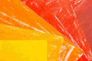
Warm colors, including red, orange, and yellow, are associated with energy, passion, and intensity. They evoke a sense of warmth and excitement, making them ideal for creating attention-grabbing designs and stimulating emotions.
Red: As mentioned earlier, red symbolizes passion, love, and energy. It is a powerful color that can evoke strong emotional responses. In marketing, red is often used to create a sense of urgency or to attract attention. It is frequently used in food industry branding to stimulate appetite and enhance the perception of flavor.
Orange: Orange combines the passion of red with the cheerfulness of yellow. It is associated with enthusiasm, creativity, and social interaction. Orange is often used in advertising and marketing to create a sense of excitement and urgency. It is also commonly used in the entertainment industry to convey a sense of fun and playfulness.
Yellow: The color of sunshine and happiness, yellow is often associated with positive emotions and optimism. It stimulates mental activity and promotes feelings of joy and energy. Yellow is frequently used in marketing to grab attention and create a sense of urgency. It is also a popular choice for brands that want to convey a sense of positivity and warmth.
Understanding the symbolism of warm colors allows us to use them strategically in branding, marketing, and design. By harnessing the power of red, orange, and yellow, we can create impactful visuals that elicit the desired emotional response and leave a lasting impression on the audience.
The Calming Effect of Cool Colors
Excellent colors, including blue, green, and purple, are associated with calmness, tranquility, and relaxation. They have a soothing effect on the mind and body, making them ideal for creating peaceful environments and promoting a sense of serenity.
Blue: Blue is often associated with calmness, trust, and dependability. It has a soothing effect on the mind and body, making it an ideal choice for environments where relaxation is desired. Blue is frequently used in healthcare settings to promote a sense of serenity and trust. It is also a popular color for bedrooms and bathrooms, creating a calming atmosphere conducive to rest.
Green: As mentioned earlier, green symbolizes nature, growth, and harmony. It has a balancing effect on emotions and is known to promote feelings of relaxation and well-being. Green is commonly used in interior design to create a sense of tranquility and connection to the natural world. It is also associated with environmental awareness and sustainability.
Purple: Purple conveys a sense of elegance, luxury, and spirituality. It has a calming effect on the mind and sparks imagination and inspiration. Purple is often used in meditation spaces and therapy rooms to create a serene and introspective atmosphere. It is also used in branding to evoke a sense of creativity and sophistication.
By incorporating cool colors into our living spaces, we can create environments that promote relaxation, focus, and well-being. Whether it’s a peaceful bedroom or a serene workspace, cool colors can help create a harmonious and calming atmosphere.
The Psychological Effects of Neutral Colors

Neutral colors, such as black, white, gray, and brown, have psychological effects on mood and emotions. They are often associated with simplicity, elegance, and versatility.
Black: Black is often associated with power, sophistication, and mystery. It can evoke a sense of authority and formality. In design, black is commonly used to create a sense of elegance and luxury. However, excessive use of black can create a somber or oppressive atmosphere.
White: White is often associated with purity, cleanliness, and simplicity. It conveys a sense of freshness and can create a feeling of spaciousness. White is commonly used in healthcare settings to promote a sense of cleanliness and sterility. It is also a popular choice for minimalist design, allowing other elements to stand out.
Gray: Gray is a versatile color that evokes different emotions depending on shade. Light gray is often associated with neutrality, calmness, and balance. It can create a sense of tranquility and sophistication. Dark gray, on the other hand, can convey a sense of seriousness, formality, and authority.
Brown: Brown is often associated with stability, warmth, and earthiness. It creates a sense of comfort and security. Brown is commonly used in interior design to create a cozy and inviting atmosphere. It is also associated with natural and organic products.
Neutral colors provide a versatile backdrop for other colors and can be used to create a balanced and sophisticated design. By incorporating neutral colors into our living spaces, we can create environments that are timeless and adaptable to different styles and moods.
Cultural Influences on Color Perception
Color perception is not universal and can be influenced by cultural factors. Different cultures may attribute different meanings to colors, leading to variations in emotional responses.
For example, in Western cultures, white is often associated with purity and innocence, while in some Eastern cultures, it symbolizes mourning and death. Similarly, red is associated with luck and celebration in many Asian cultures, while in Western cultures, it is often associated with passion and danger.
These cultural influences on color perception are essential when designing for a global audience or targeting specific cultural groups. By understanding the cultural associations and symbolism of colors, we can create designs that resonate with the intended audience and avoid any unintended negative connotations.
Applying Color Psychology in Marketing and Branding
Color plays a crucial role in marketing and branding, as it can influence consumer perceptions, emotions, and purchasing decisions. Businesses can create powerful and memorable brand experiences by strategically using color psychology principles.
When selecting colors for branding, it’s essential to consider the target audience, industry, and desired brand personality. For example, a health and wellness brand may choose calming blues and greens to convey a sense of tranquility and trust. In contrast, a fashion brand targeting young and energetic consumers may opt for vibrant and bold colors to create a sense of excitement and individuality.
Color psychology can also be used in marketing materials, such as advertisements and packaging. By understanding the emotions and associations evoked by different colors, businesses can create visuals that grab attention, elicit desired emotional responses, and differentiate themselves from competitors.
Using Color Psychology in Interior Design
Color psychology is widely used in interior design to create harmonious and inviting spaces that promote well-being and reflect the desired atmosphere.
When designing a living space, it’s essential to consider the function of the room and the emotions you want to evoke. For example, in a bedroom, you may want to create a calm and relaxing atmosphere using cool colors such as blues and greens. In a dining room, warm colors like reds and oranges can stimulate appetite and create a lively ambiance.
Colors can also be used to manipulate the perception of space visually. Light colors like whites and pastels can make a room appear larger and more spacious. Dark colors, on the other hand, can create a sense of coziness and intimacy in larger spaces.
Incorporating color psychology principles into interior design allows you to create spaces that look aesthetically pleasing, promote a sense of well-being, and reflect the desired ambiance.
Color Psychology in Art and Therapy

Color psychology is not limited to marketing and design; it also plays a significant role in art and therapy. Artists often use colors intentionally to evoke specific emotions and create powerful visual experiences.
In art therapy, color is used for self-expression and emotional healing. Different colors can be associated with specific emotions, and clients are encouraged to explore their feelings through color selection and creation.
For example, warm colors like red and orange may express anger or passion, while cool colors like blue and green may represent calmness or serenity. By exploring and interpreting the emotions associated with different colors, individuals can gain insight into their emotional states and find healing through the creative process.
Conclusion
Color psychology is a fascinating field that illuminates colors’ profound influence on our minds and mood. From the vibrant red of passion to the calming blue of tranquility, colors evoke specific emotions and shape our perceptions in powerful ways. By understanding the basics of color theory, the impact of primary and secondary colors, and the cultural influences on color perception, we can harness the power of color psychology in various aspects of our lives.
Whether it’s creating impactful marketing materials, designing harmonious living spaces, or finding healing through art and therapy, color psychology offers valuable insights into how colors can elevate our experiences and evoke the desired emotional response.
So, the next time you choose a color for your brand, paint your walls or create a piece of art, remember the science behind how colors influence our mind and mood. Embrace the power of color psychology and let it guide you toward creating meaningful and impactful experiences.